Business Professionals
Techno-Business Professionals
Power BI | Power Query | Advanced DAX | SQL - Query &
Programming
Microsoft Fabric | Power BI | Power Query | Advanced DAX |
SQL - Query & Programming
Power BI | Power Apps | Power Automate | Copilot Studio | Power Pages | Dataverse
Microsoft Power Apps | Microsoft Power Automate
Power BI | Adv. DAX | SQL (Query & Programming) |
VBA | Python | Web Scrapping | API Integration
Power BI | Power Apps | Power Automate |
SQL (Query & Programming)
Power BI | Adv. DAX | Power Apps | Power Automate |
SQL (Query & Programming) | VBA | Python | Web Scrapping | API Integration
Power Apps | Power Automate | SQL | VBA | Python |
Web Scraping | RPA | API Integration
Technology Professionals
Power BI | DAX | SQL | ETL with SSIS | SSAS | VBA | Python
Power BI | SQL | Azure Data Lake | Synapse Analytics |
Data Factory | Databricks | Power Apps | Power Automate |
Azure Analysis Services
Microsoft Fabric | Power BI | SQL | Lakehouse |
Data Factory (Pipelines) | Dataflows Gen2 | KQL | Delta Tables | Power Apps | Power Automate
Power BI | Power Apps | Power Automate | SQL | VBA | Python | API Integration
Power BI | Advanced DAX | Databricks | SQL | Lakehouse Architecture
Business Professionals
Techno-Business Professionals
Power BI | Power Query | Advanced DAX | SQL - Query &
Programming
Microsoft Fabric | Power BI | Power Query | Advanced DAX |
SQL - Query & Programming
Power BI | Power Apps | Power Automate | Copilot Studio | Power Pages | Dataverse
Microsoft Power Apps | Microsoft Power Automate
Power BI | Adv. DAX | SQL (Query & Programming) |
VBA | Web Scrapping | API Integration
Power BI | Power Apps | Power Automate |
SQL (Query & Programming)
Power BI | Adv. DAX | Power Apps | Power Automate |
SQL (Query & Programming) | VBA | Web Scrapping | API Integration
Power Apps | Power Automate | SQL | VBA |
Web Scraping | RPA | API Integration
Technology Professionals
Power BI | DAX | SQL | ETL with SSIS | SSAS | VBA
Power BI | SQL | Azure Data Lake | Synapse Analytics |
Data Factory | Azure Analysis Services
Microsoft Fabric | Power BI | SQL | Lakehouse |
Data Factory (Pipelines) | Dataflows Gen2 | KQL | Delta Tables
Power BI | Power Apps | Power Automate | SQL | VBA | API Integration
Power BI | Advanced DAX | Databricks | SQL | Lakehouse Architecture

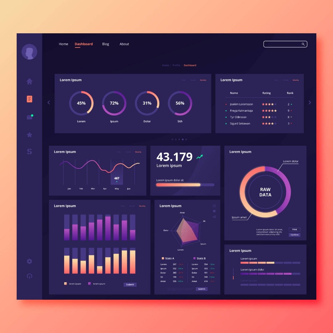
Dashboards are one of the most powerful features of Power BI. They allow organizations to monitor performance, track business metrics, and identify trends through visual analytics.
However, simply placing charts on a dashboard does not automatically create useful insights. Poorly designed dashboards can overwhelm users and make it difficult to interpret the data.
Professional data analysts therefore follow specific dashboard design best practices to ensure their reports communicate insights clearly. This article explains several key principles that can help improve the effectiveness of Power BI dashboards.
A common mistake when designing dashboards is including too many metrics.
Instead, dashboards should focus on the most important key performance indicators (KPIs) relevant to the business problem being analyzed.
For example:
• sales dashboards may highlight revenue growth and top-performing products
• HR dashboards may focus on employee attrition and workforce trends
• marketing dashboards may track campaign performance
By focusing on a few critical metrics, dashboards become easier to interpret.
Different types of charts serve different purposes.
Some commonly used visualizations include:
• bar charts for comparisons
• line charts for trends over time
• pie charts for proportions
• maps for geographic analysis
Selecting the appropriate visualization helps users understand insights quickly.
Consistency plays an important role in dashboard usability.
Analysts should maintain consistent:
• color schemes
• fonts
• layout structure
• chart styles
Consistent design helps users interpret dashboards more easily.
Too many visuals can make dashboards confusing and difficult to navigate.
A well-designed dashboard typically includes 6–8 visuals that clearly communicate the most important insights.
Analysts should also ensure sufficient white space between visuals to improve readability.
Designing effective dashboards requires a combination of data modeling, visualization, and analytical thinking.
If you are exploring analytics careers, our guide on How to Become a Power BI Data Analyst in Canada explains the skills required to transition into business intelligence roles.
Professionals who specialize in dashboard reporting and data visualization often pursue roles such as Business Intelligence Analyst or Data Analyst.
For a detailed overview of salary trends across Canadian cities, you may refer to our article on Power BI Salary in Canada (2026 Job Market Report).
Editor’s NoteThis article outlines general principles for designing effective Power BI dashboards.
For learners interested in developing practical dashboard skills through hands-on projects, instructor-led programs such as the Power BI Course offered by Excelgoodies combine dashboard design, data modeling, and analytics scenarios in guided learning environments.
Power BI
New
Next Batches Now Live
Power BI
SQL
Power Apps
Power Automate
Microsoft Fabrics
Azure Data Engineering